Create Stand Out Podcast Cover Art
First impressions matter more than most realize. They are the reason that you wouldn’t go to a job interview in your casual garb or on a first date in your pajamas.
For this same reason, it is crucial to have podcast cover art that grabs viewers’ attention and can stop someone mid-scroll. Take a second to think about what attracted you to listen to a podcast that you hadn’t heard about before. For myself and many others we decide on our next podcast to view, or at least what podcast bios to read, by their title and cover art.
Think about it this way, when we eat we use multiple senses to decide if we are enjoying the food. We use our sense of smell, taste, and visuals to decipher what food we enjoy. Similarly, we choose our entertainment by what is visually appealing, sounds good (both verbiage and sound quality), and of course appeals to our common interests.
Creating stand out podcast cover art should be given the same amount of effort that musicians put into album art. It should be attention-grabbing, represent your podcast, and stand out amongst other shows’ cover art. As you think about what makes your content different, include your cover art in your planning.
Understanding the Basics of Podcast Cover Art
While you’re creating your podcast cover art, as with your podcast episodes, remember that the execution of the design is as important as the design itself.
As a matter of fact, your cover art may not be accepted if it is not done well. For example, Apple has specifications, such as artwork must be original and can not contain blurry images, explicit language, reference to illegal drugs, and more. View Apple’s artwork requirements here.
Whilst creating your cover art to follow guidelines you’ll want to make sure that your art is useable in multiple platforms and sizes. You can use the cover art as your social media thumbnails as well as sharing it as a post. To ensure that you can use your cover art as much as possible you need to:
ensure the use of high-resolution images
avoid blurry images and pixelation by:
Make sure the picture is saved as a JPG or GIF
is a perfect square
has an aspect ratio of at least 1600 x 1600 pixels in size
ensure visibility and clarity across different platforms
Use on Apple, Spotify, Amazon Music, or any platform you plan to use
thumbnail considerations for social media sharing
The design should be able to be used in a thumbnail, social post, or poster with no problem.
Elements of Standout Podcast Cover Art
What about the design? While the quality and specifications are important to be able to use across all platforms and avoid bad resolution, the podcast cover art design is what is going to ultimately grab a new listeners attention. You don’t want to use just any cover art! When planning think about having an eye-catching design, relevance to your podcast content, as well as branding consistency.
Eye-Catching Design
Color: color actually has a psychological impact and can affect moods or feelings. Much like when picking colors for your house, when choosing colors for your design you want to think about what feelings the color will convey and how it will affect your listener. Art Therapy has a great blog on colors and their effects. Some of these are:
white = neutrality
green = health
red = love
orange = warmth
yellow = hunger
Fonts: like color your font can leave an impact on how your listener views your podcast. Different fonts can evoke feelings of trust, power, friendliness, etc. Therefore, choosing fonts and typography is important - you also want to choose a font that you can use across all platforms and match your branding.
Design complexity: Of course, the design is going to take the most thought and time to execute. What goes into planning your design? Keeping branding in mind you do want to find a balance of simplicity and complexity in your design. Your podcast cover art design should convey the essence of your show. Medium has a great article to help you think about how minimalist or complex your art should be to portray what you would like to get across to your listeners. Once you decide on the complexity of your design you want all of your design aspects to say something. i.e. don’t use a photo just to use one, you want the photo to ‘say’ something.
2. Relevance to Content: as mentioned above, when creating your design you want to make sure it reflects your podcast and the message you are hoping to impart by:
Reflecting the podcast's theme and genre
If about cars, you would not want to have a design that includes airplanes as this would imply a different topic
Conveying the podcast's tone through imagery
Is your podcast goofy, serious, educational? You can use imagery that fits the vibe of your show.
Using symbolism effectively by using imagery that portrays a specific meaning.
3. Branding Consistency: Don’t forget about your brand when creating your podcast cover art! Make sure that it matches the vibe of your podcast as well as being able to be used on different platforms by:
Incorporating brand colors and logos
Ensuring consistency with other branding materials
if your logo uses certain colors, try to incorporate those colors in your design. This is a good reminder to make sure your brand colors portray the emotions that you want your listener to feel.
Building a recognizable brand identity is important as it helps your listeners recognize your content without having to search for your podcast title or social media handles.
Tips for Creating Engaging Podcast Cover Art
All of the above means nothing if your podcast cover art does not engage potential listeners. Podcast cover art needs to also focus on readability -
Ensuring text is legible, even at smaller sizes
Strategic placement of text for impact
Testing readability on different devices: can you read text on your phone, laptop, or tablet?
After you create your podcast cover art it is crucial to test and iterate. As in construction, your motto should be “Measure twice, cut once”.
Gathering feedback from potential listeners (or current listeners if you are changing it up!) Plus, it’s a great way to include them
A/B testing variations of cover art
Making iterative improvements based on performance
Also, remember that feedback is key! Listen to your viewers and check your metrics and analytics.
Tools and Resources for Designing Podcast Cover Art
Podcasting often turns into much more than just recording and posting episodes. You quickly become a host, editor, graphic designer, and more. This can be daunting as all aspects play a big role in the success of your show. If you are taking on creating podcast cover art with no background in designing some tools can be helpful!
Use graphic design tools! There are lots of design tools you can use such as Adobe, Inkscape, Canva, and more. A further list of design tools can be found here!
We often use Canva ourselves to design our branding images such as podcast cover art! Even better you can use the free function and free templates or pay for the Pro tier and get more access
Utilizing templates and online resources is a great way for a beginner to create their design without having to do so from scratch - taking up much less time than learning from start to finish. As mentioned above, Canva is a great graphic design tool that allows users to share and use other’s templates as a starting point. Allowing you to change images, colors, fonts, and more all while keeping the required formatting intact.
Even with free or paid tools, creating podcast cover art as a beginner can be difficult. taking a lot of trial and error to create what you are hoping for. While it is a money suck, hiring professional designers and considerations may be the right move for you. As you can give the designer your branding, color preferences, and design thoughts and they can do the hard work to execute your design.
Show some Examples of Successful Podcast Cover Art
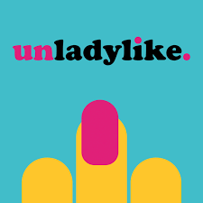
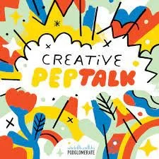
Here are some great examples of successful podcast cover art - some you may recognize. As you can see some designs are extremely simple while others have complexity that fits the show vibe.
Conclusion
Podcast cover art is another aspect of your show that can either negatively or positively impact the success of your show. Whether it attracts or deters your ideal listener is the focus, as well as the ability to use it across different platforms, and fit each platform’s specifications/requirements.
Take the time to review and research requirements, emotions you can convey through fonts and colors, and test the design amongst peers and current listeners. Keeping your podcast cover art on brand helps you use your work in multiple ways as well as ease for your listener to find you!
You may decide it’s best to outsource your cover art, leave it up to someone who already knows what is needed to ensure proper sizing and can work with you to create the design of your dreams. Either way, take your time and be thoughtful!
Hav


